Welcome to our marketing insights blog! At 360 Marketers, we understand that effective branding is the cornerstone of a successful business. One of the most powerful yet often overlooked elements of branding is color. Today, we’ll explore the importance of color in branding, how to choose the right colors for your logo, and how to use color effectively in your Instagram grid to create a cohesive and compelling brand presence.
The Psychology of Color in Branding
Color is not just about aesthetics; it’s a form of communication. Colors evoke emotions, convey messages, and can significantly influence consumer behavior. Here’s a quick overview of what different colors typically represent in branding:
Red: Excitement, passion, urgency
Blue: Trust, professionalism, calm
Green: Growth, health, tranquility
Yellow: Optimism, energy, attention
Orange: Creativity, enthusiasm, warmth
Purple: Luxury, wisdom, creativity
Black: Sophistication, elegance, power
White: Purity, simplicity, cleanliness Understanding these associations can help you choose colors that align with your brand’s values and message, ultimately strengthening your branding strategy.
Choosing Colors for Your Branding and Logo
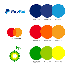
Your logo is often the first interaction a customer has with your brand, making it crucial to choose colors that resonate and reinforce your branding. Here are some tips for selecting the perfect palette:
1. Understand Your Brand Identity
Before selecting colors, clearly define your brand’s identity. What are your core values? What message do you want to convey? Who is your target audience? The answers to these questions will guide your color choices and enhance your branding efforts.
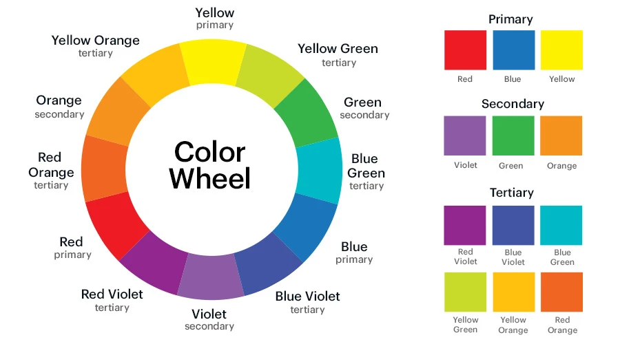
2. Consider Color Harmony
Choose colors that work well together. The color wheel is a valuable tool here. Complementary colors (opposite each other on the wheel) create contrast and are eye-catching, while analogous colors (next to each other on the wheel) offer harmony and are pleasing to the eye. This harmony is essential for cohesive branding.
3. Think About Versatility
Your logo will appear in various contexts, from business cards to billboards to social media. Ensure the colors you choose look good in different sizes and on different backgrounds. It’s also wise to have a black-and-white version for flexibility. Versatility is key to maintaining consistent branding across all platforms.
4. Limit Your Palette
Too many colors can be overwhelming and dilute your brand message. Aim for one to three primary colors in your logo. Additional accent colors can be used in marketing materials and social media content, ensuring a unified branding approach.
Using Colors in Your Instagram Grid for Effective Branding
Your Instagram grid is a visual representation of your brand. Consistent use of color can make your grid more cohesive and visually appealing, strengthening your branding. Here’s how to effectively use color on Instagram:
1. Establish a Color Theme
Choose a color theme that aligns with your brand identity. This could be based on your logo colors or other complementary hues. Stick to this theme to create a recognizable and cohesive look, which is vital for effective branding on social media.
2. Plan Your Grid Layout
Think of your Instagram grid as a whole rather than individual posts. Plan your posts in advance to ensure the colors are balanced and follow your theme. Tools like Planoly or Preview can help you visualize your grid before posting, aiding in consistent branding.
3. Use Color to Highlight Key Elements
Use your brand colors to highlight important elements in your posts, such as product features, announcements, or calls to action. This helps draw attention to key messages and maintains brand consistency, crucial for effective branding.
4. Balance with Neutral Tones
Incorporate neutral tones like white, black, or gray to balance your grid and prevent it from becoming too overwhelming. Neutral backgrounds or borders can help your primary colors stand out more effectively, enhancing your branding efforts.
5. Experiment with Color Blocking
Color blocking involves using large blocks of solid color in your posts. This technique can make your grid look modern and organized. Alternate between your brand colors and neutrals to create a visually appealing pattern, reinforcing your branding strategy.
Color is a powerful tool in branding that can significantly impact how your audience perceives your brand. By carefully choosing the right colors for your logo and using them consistently in your Instagram grid, you can create a strong, cohesive brand identity that resonates with your audience and stands out in a crowded market.
At 360 Marketers, we specialize in helping businesses harness the power of color and design to create compelling brand identities. Contact us today to learn how we can elevate your branding!
About Us 360 Marketers is dedicated to helping businesses thrive through strategic branding and innovative marketing solutions. From logo design to social media strategies, our team of experts is here to support you every step of the way. Let’s create something amazing together!